Enso Security
Cyber Security SaaS Product / 2021 - 2022 / Part of Snyk
Enso Security (acquired by Snyk) is an end-to-end security posture management application (ASPM) and the first in this cyber category. ASPM is an agile AppSec delivery model in which resources, processes, and technologies are effectively employed to lead a high-performance and systemic, yet sustainable, AppSec program. Enso provides full visibility and automatic discovery of your entire application environment.
During my year as Product Design Lead (solo) for the company, I redesigned the whole product (UI and UX), as well as two marketing websites: Enso's website and the AppSec map.
System Redesign
My first assignment in Enso was to redesign the system, after receiving user complaints regarding its outdated appearance. Although the mission focused on redesigning the UI, I was exposed to UX issues while navigating through the product, and together with Moti, the VP product, and Shady, the product manager, we’ve managed to fix all issues during the redesign process.
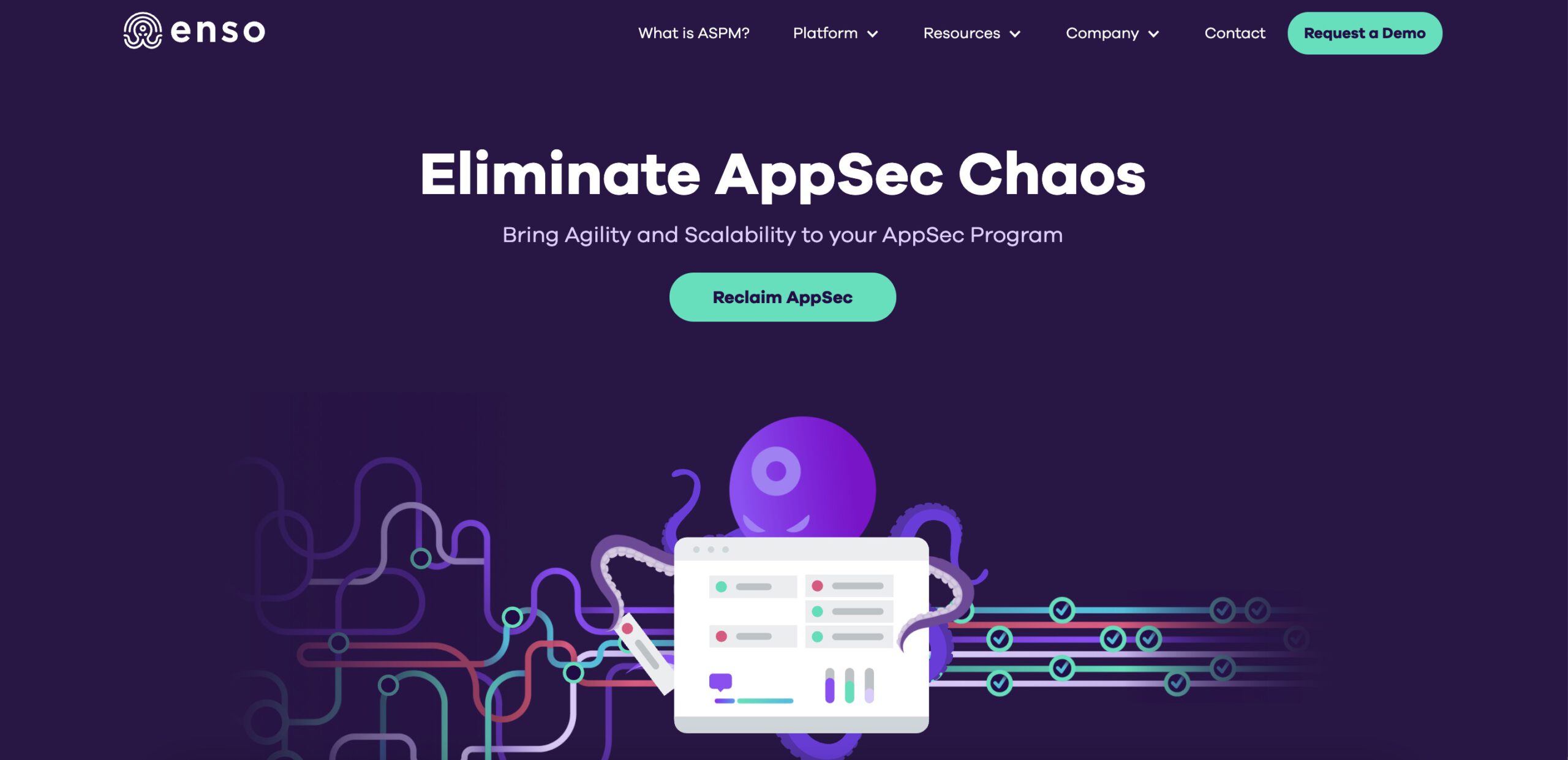
As a starting point, I noticed a gap between the marketing site of Enso and the product itself – while the website was decorated with colorful images of the Benso octopus character, the product itself seemed like any other generic cyber product. In addition, the product was not recognizable from a distance, and appeared blurry, as opposed to a product such as Facebook, which can be recognized even when looking at a screen from the other end of a hallway.
Gaps between the product and marketing
References
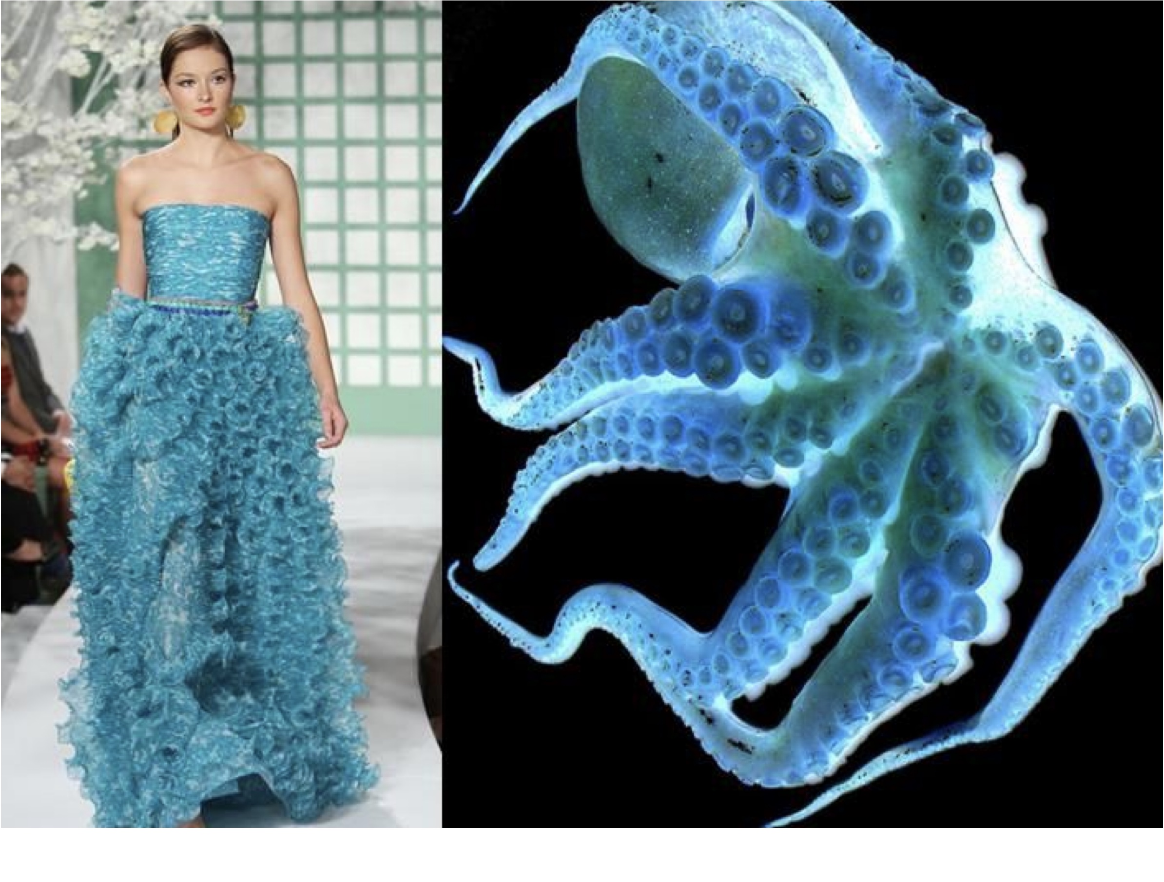
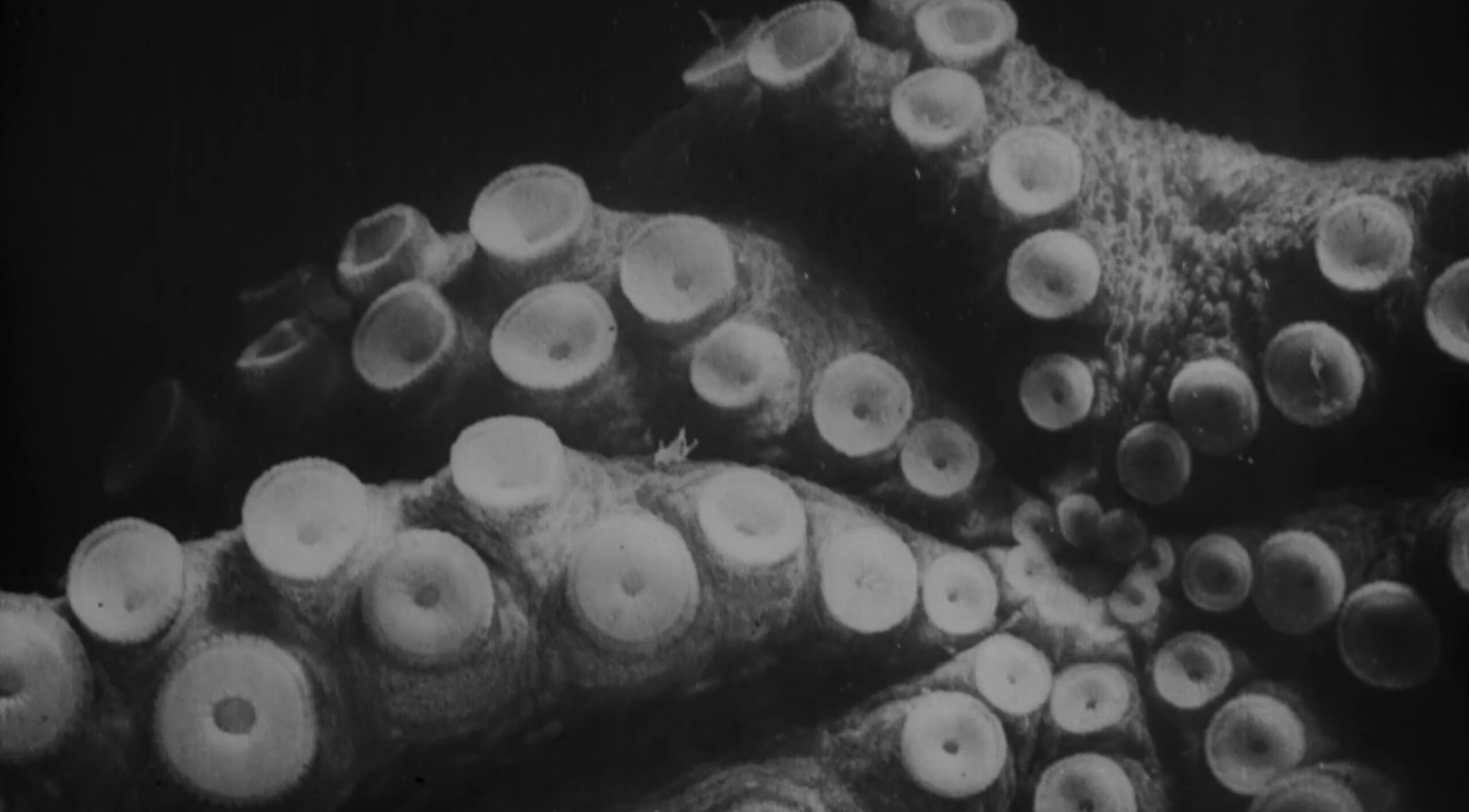
I’ve looked into inspirations and references from many fields: I’ve studied the octopi world in depth, their movement, shape and materials. Inspired by this research, I extracted the following features and values: Movement, Elasticity, Flexibility, Wide Vision, Sharp Senses and Suitability.
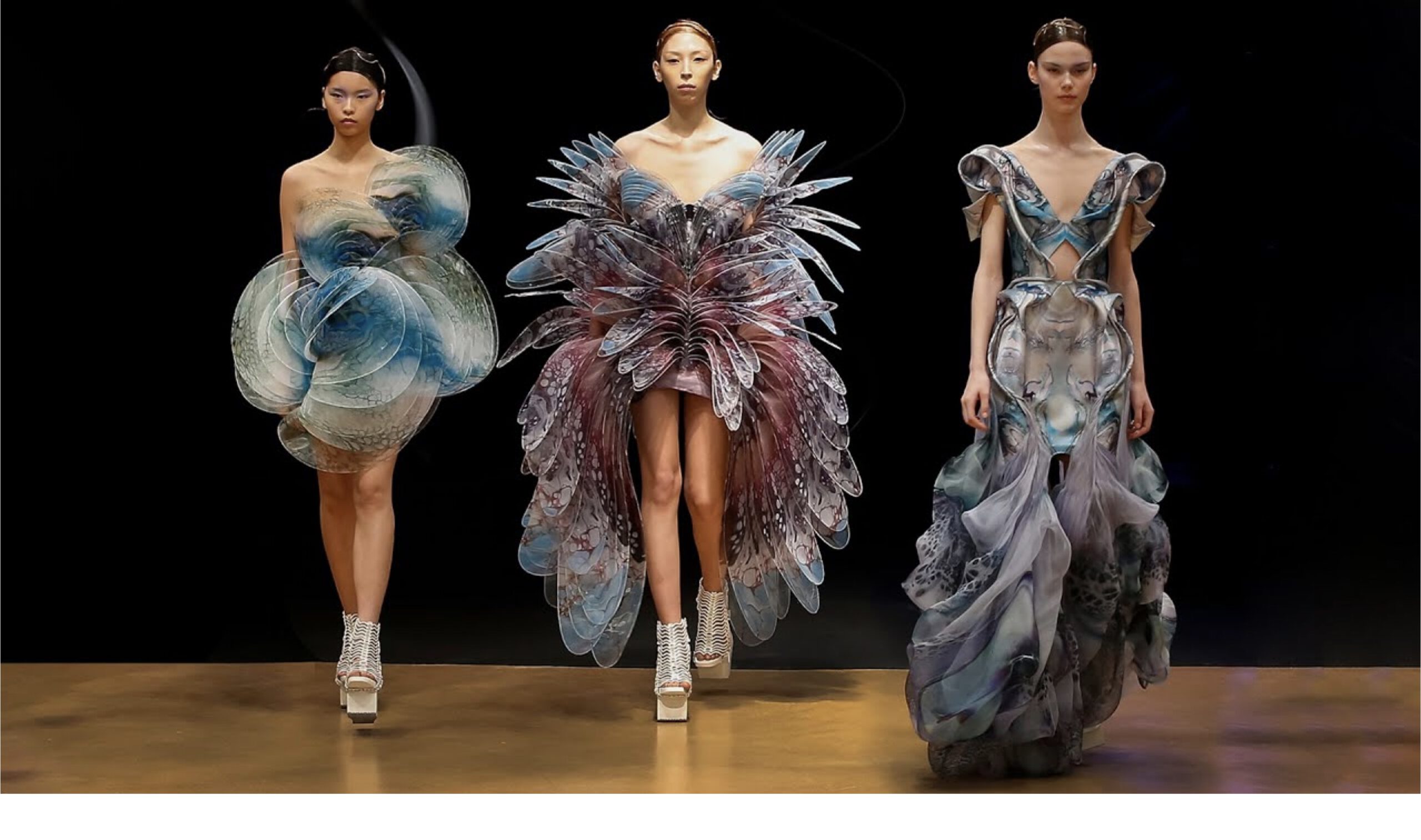
In the field of fashion design, I’ve looked into the dresses of designers Iris Van Herpen and Alesandro Michele and studied how they moved and fluttered on the runway.
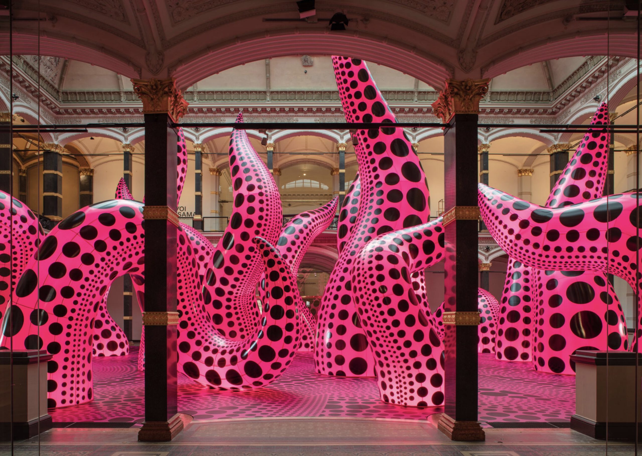
Another interesting reference was a large-scale exhibit of purple octopus tentacles covered with black dots, which was part of the retrospective exhibition of the artist Kusama in the Tel-Aviv Museum.
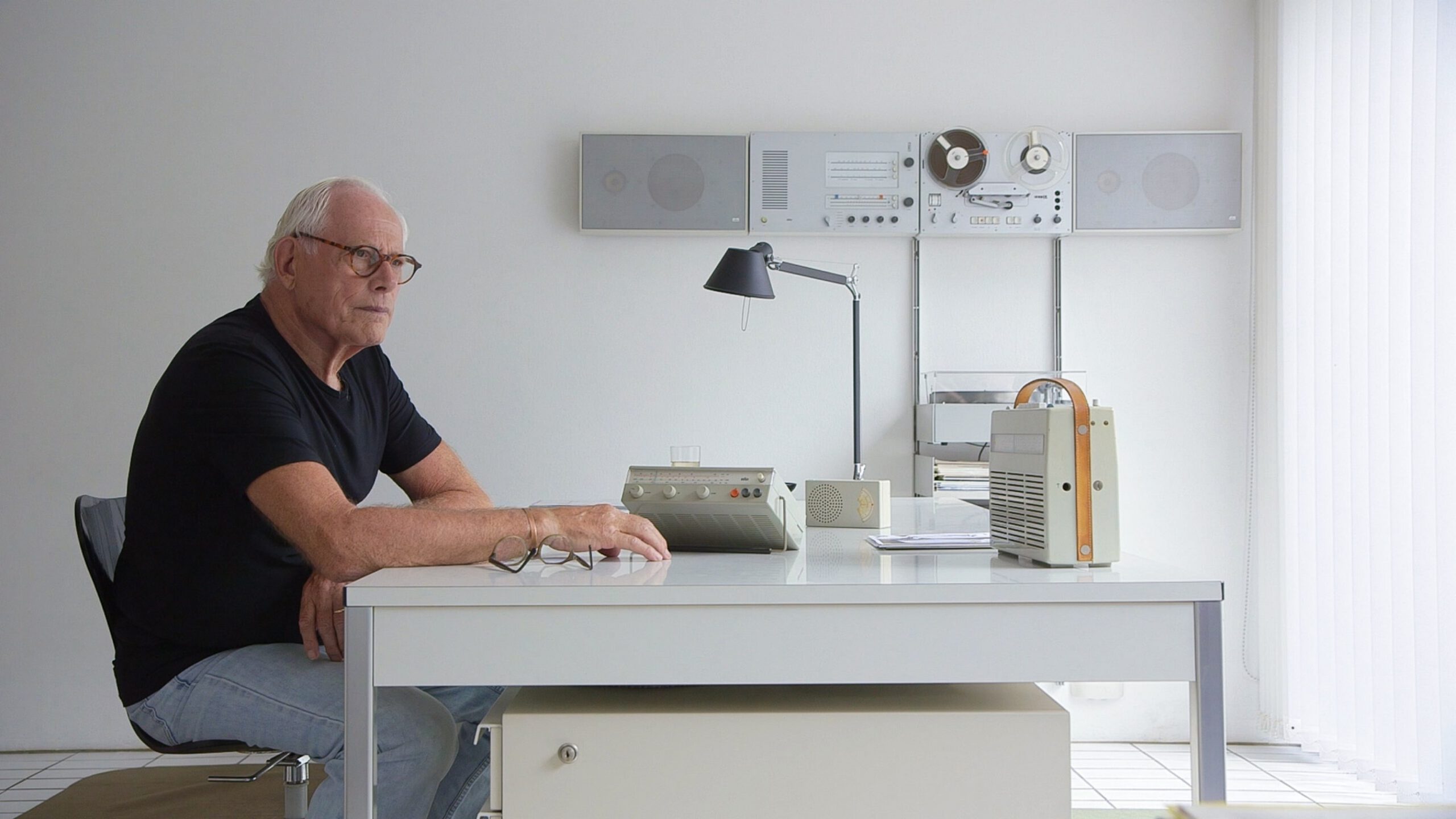
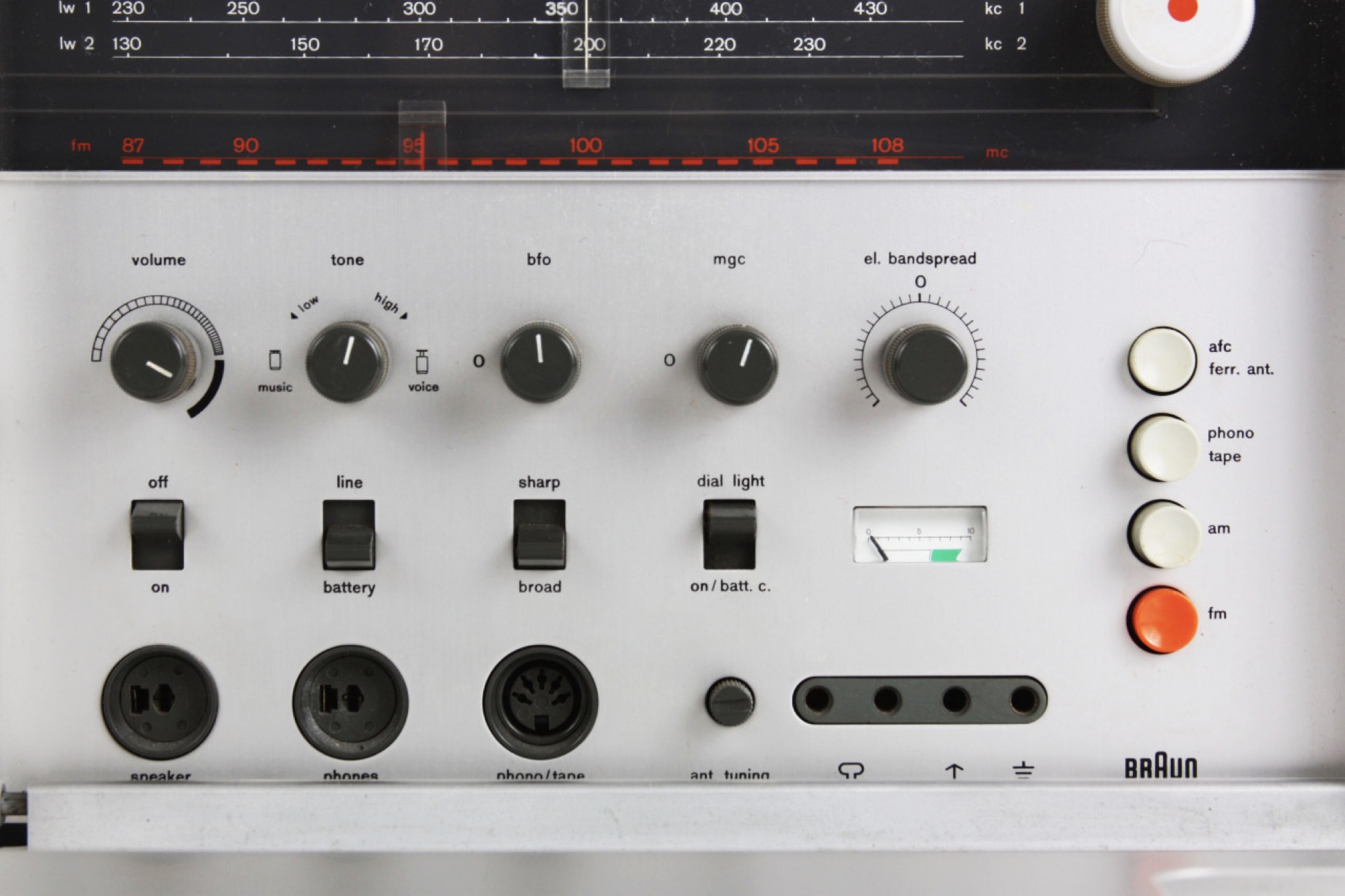
Furthermore, as part of my in-depth research, I came across products from the 60s and 70s which were designed by the renown industrial designer Dieter Rams, of the Braun company. His minimalistic line helped me refine the design of the interfaces I worked on without overloading the users.
The last part of my research dealt with the city we were in – the white city of Tel Aviv – in which I found interesting references to Bauhaus graphic design and architecture.
Typography
Two main issues stood out in the UI of the existing screens: overuse of colors on the gray color-scale, and a generic Google font. I searched for fonts to correspond with the features and values I found, as mentioned above.
I checked who was the font designer for Atlassian, and discovered James Edmonson, also known as OH NO TYPE, an exquisite typographer I’ve met in 2019, at a lecture he gave on his work, at a Typography convention in New York.
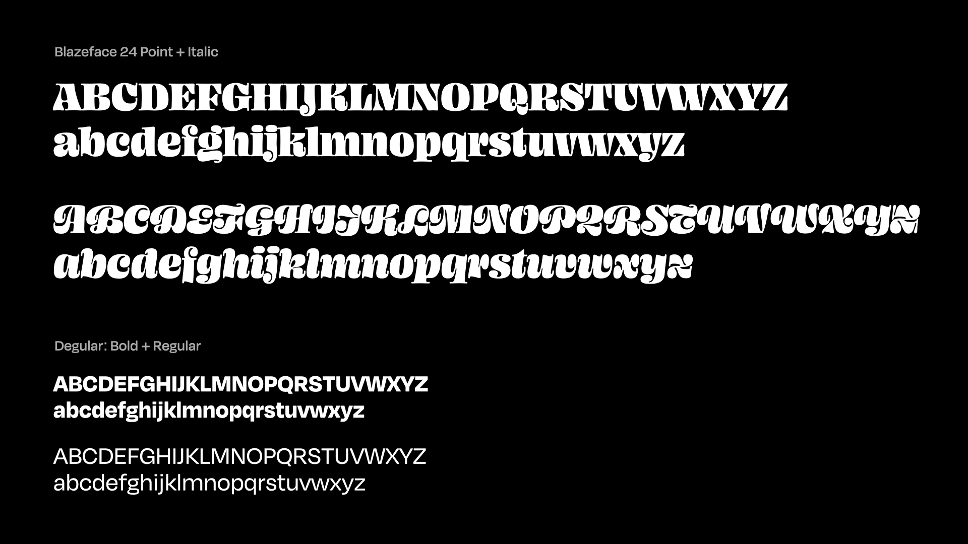
I chose two font families he designed: Blazeface and Degular. The Blazeface font is octopus-like, cursive, movement-flowing into and out of internal spaces. I planned on using it in the design of product headlines and marketing materials.
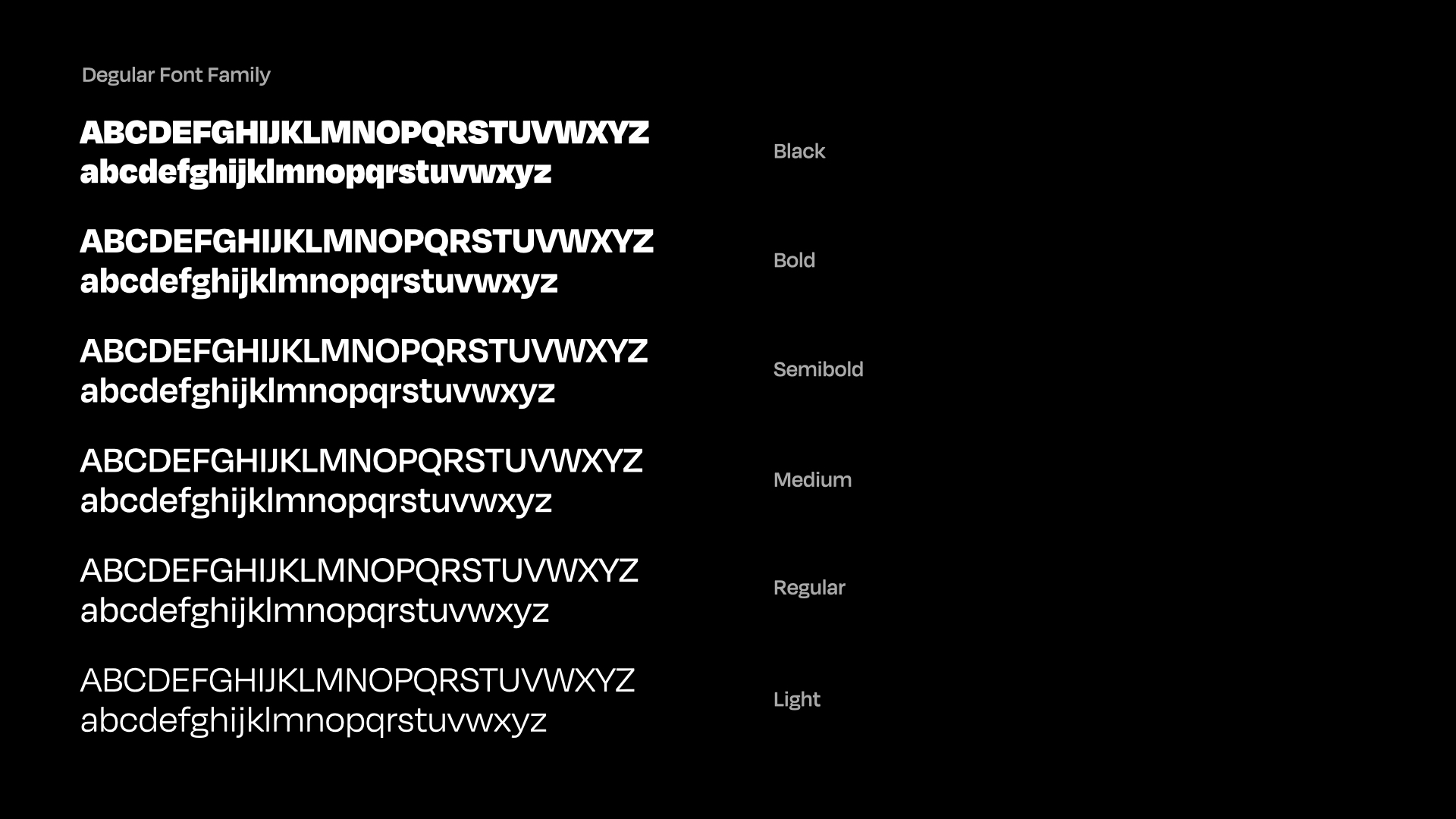
In opposition, the Degular font appears quite ordinary at first glance, but once you dive into it and read it, it reveals its memorability and its smooth flow of letters. This font was designed for all other components. A month into the process, I presented the entrepreneurs with my work and usage of fonts in the product and the marketing materials. While the Degular font was well received, they didn't like the Blazeface font. So, we bought the whole Degular font family.
Blazeface and Degular (OH NO TYPE)
The final decision: Degular font-family (OH NO TYPE)
Colors
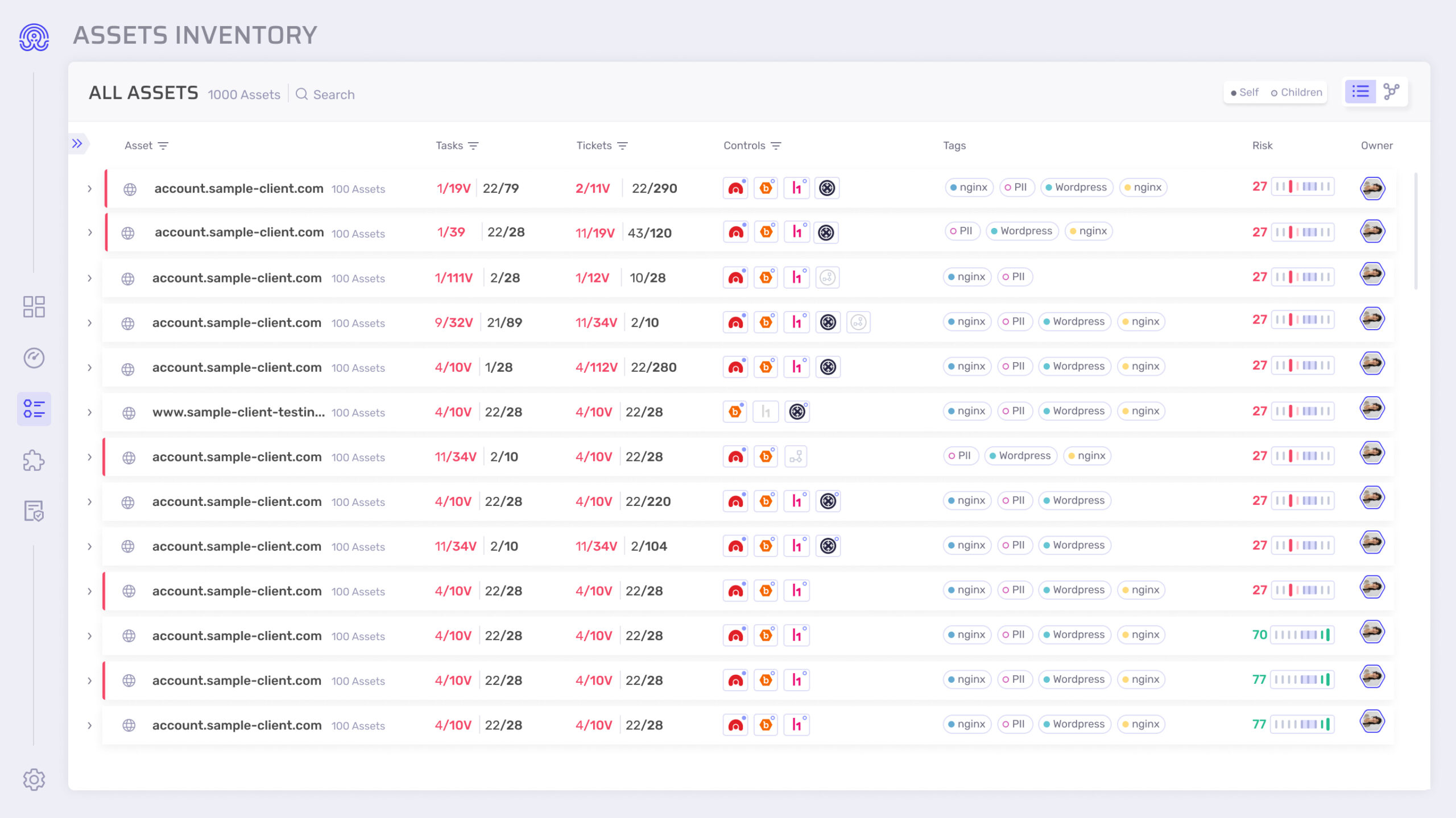
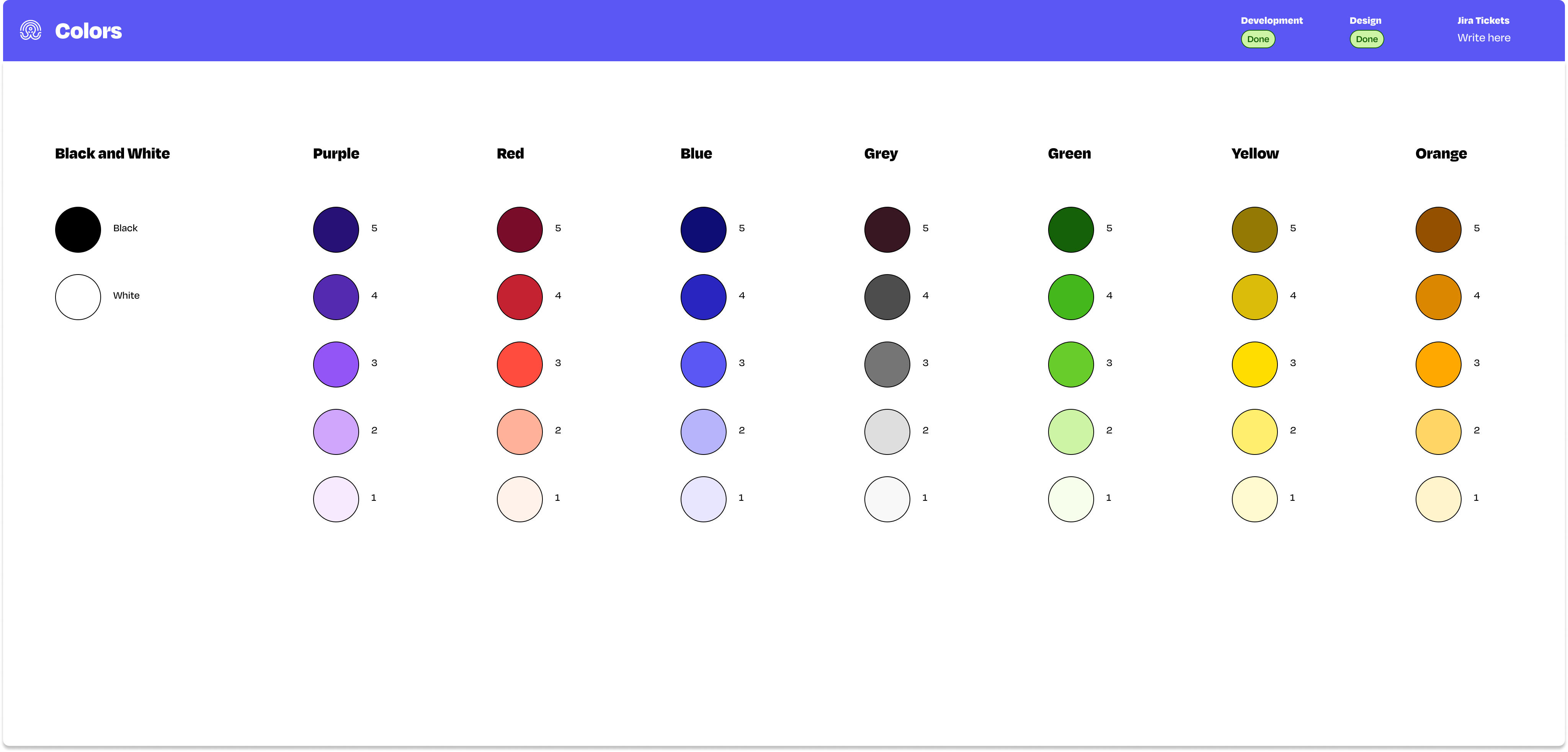
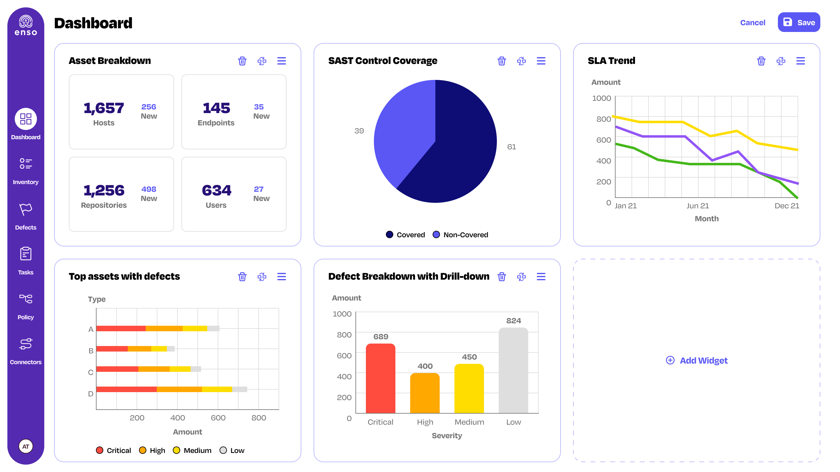
I narrowed down the color palate, cleaned the system from any gray scale, the background was turned white, and the colorfulness became better contrasted and more accessible for the disabled.
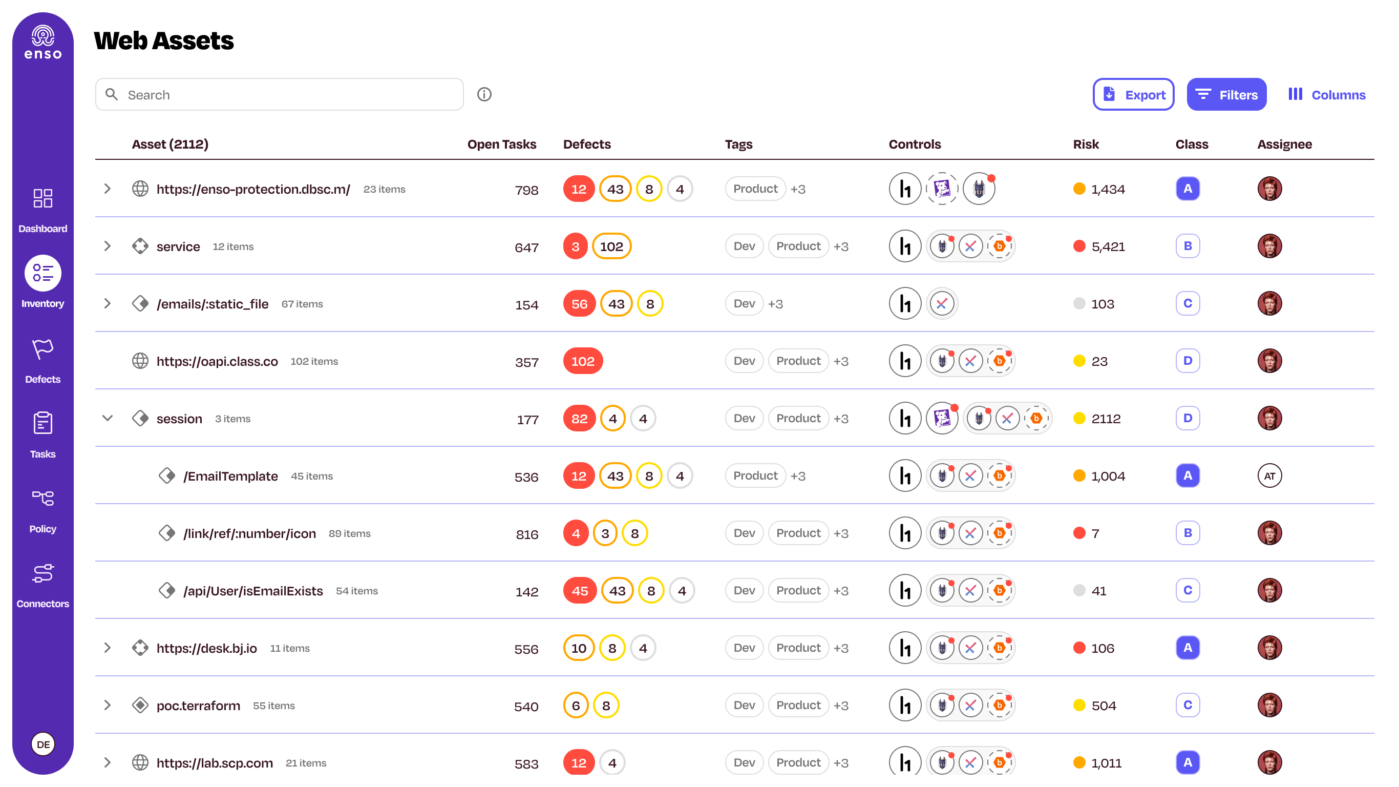
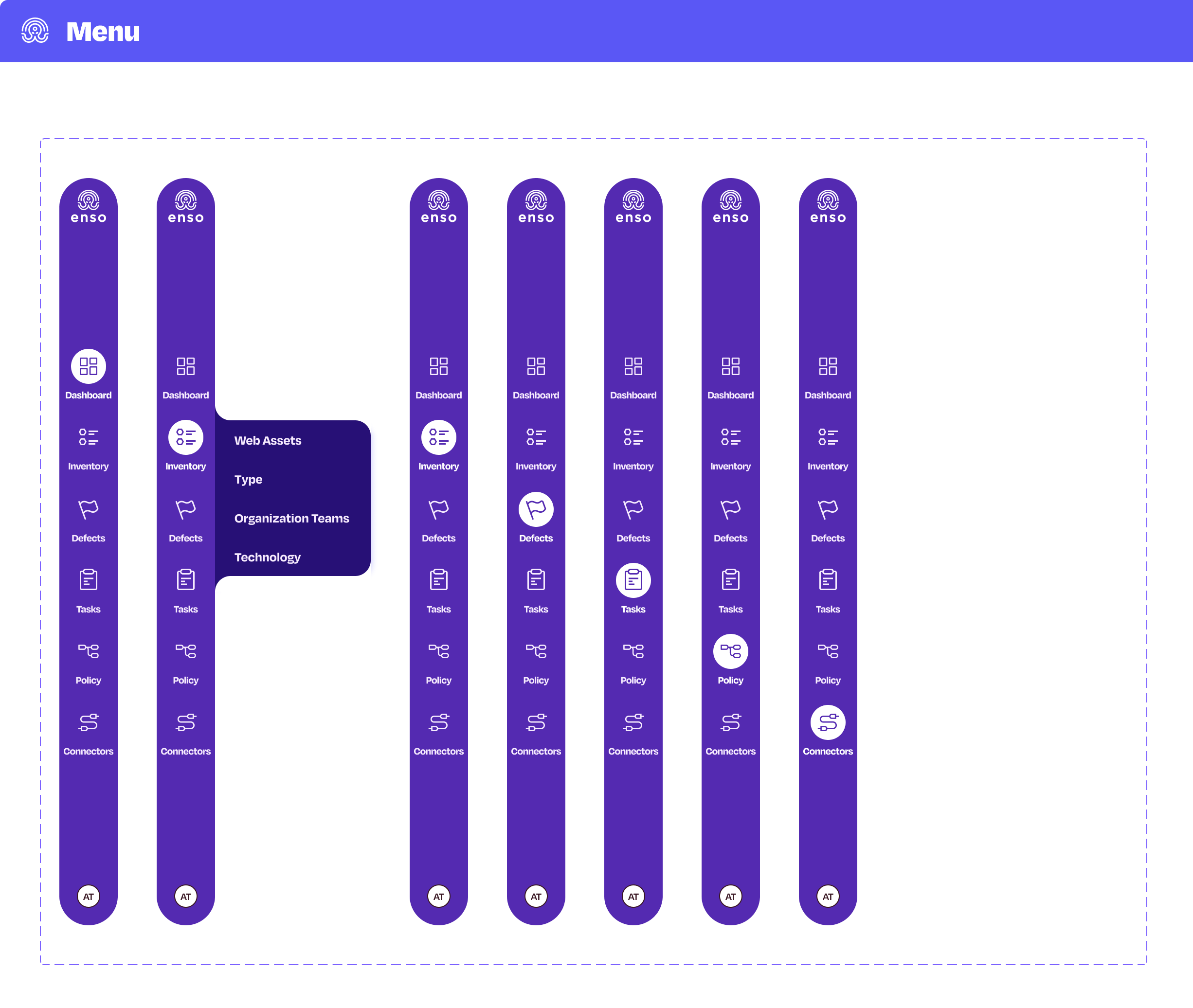
On the left-hand side, I added a purple stripe with curved edges to be used as the main menu, as a small and iconic element to create a recognizable look for Enso, when looking at it from afar. The Degular font family was incorporated at the design of the product, from headlines, buttons to the smallest texts, and changed the on-screen reading flow for the better. In the previous design, the fonts were too small, therefore they have been enlarged so that the new system could be more accessible and readable.
Color Palette
Enso - Asset Inventory
UX Process
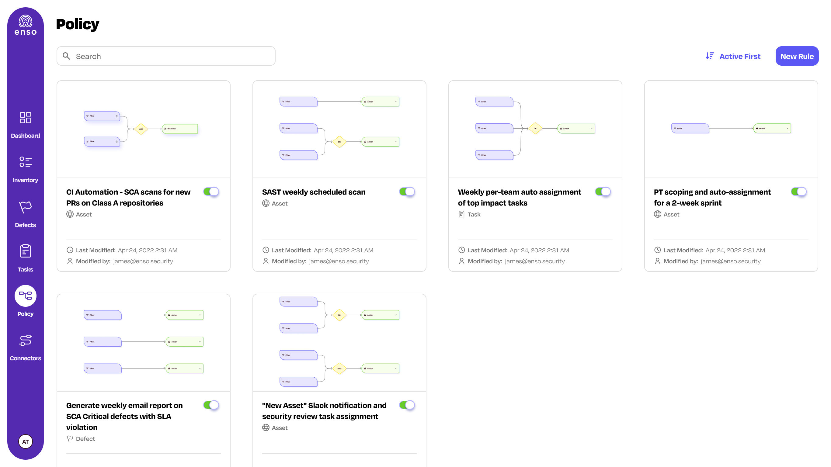
The table pages Defects, Inventory and Tasks also change significantly. Each of them included typographic hierarchy issues, and especially issues in navigation. For instance, in Inventory, the navigation between the different modes – Service, Host, and Endpoint – was hidden behind a small arrow that opened a drawer menu.
The product team decided to improve the navigation: after clicking on the inventory menu item, the user would have a secondary menu, which is more intuitive.
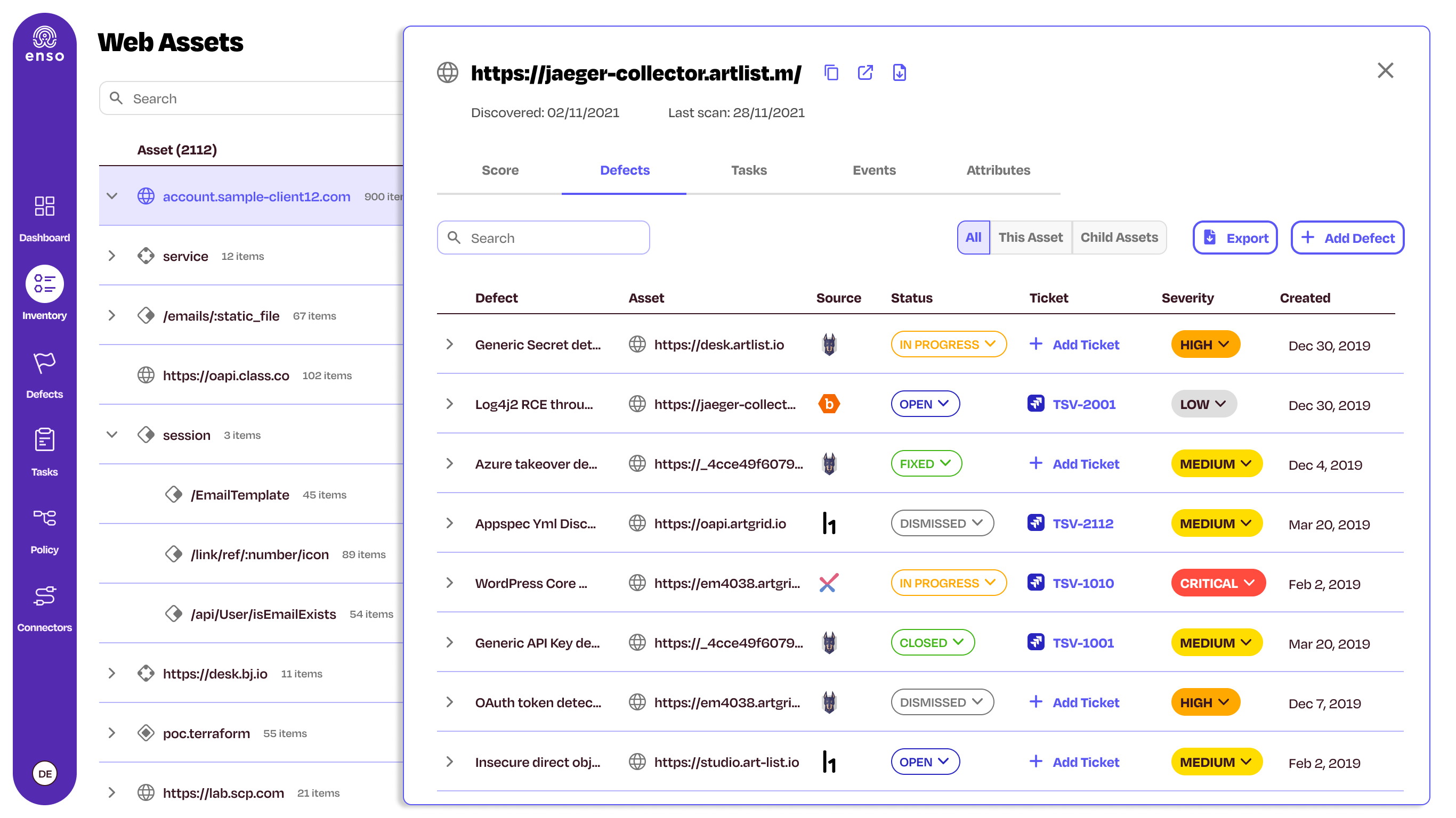
Another issue was revealed in compatibility, when clicking on some of the rows opened a limited-height expander that contained additional content. The content changed according to the entity: description, ID, and Jira Ticket area. The limited space encumbered the continued growth of the product. In order to solve this issue, I designed a Single Page for each of the tables. A click on a row prompted a modal with additional, useful, and in-depth data concerning the entity. In place of the limited space, I designed a wide page that spread across 2/3 of the screen, along with easy navigation between tabs:
Single Asset Page
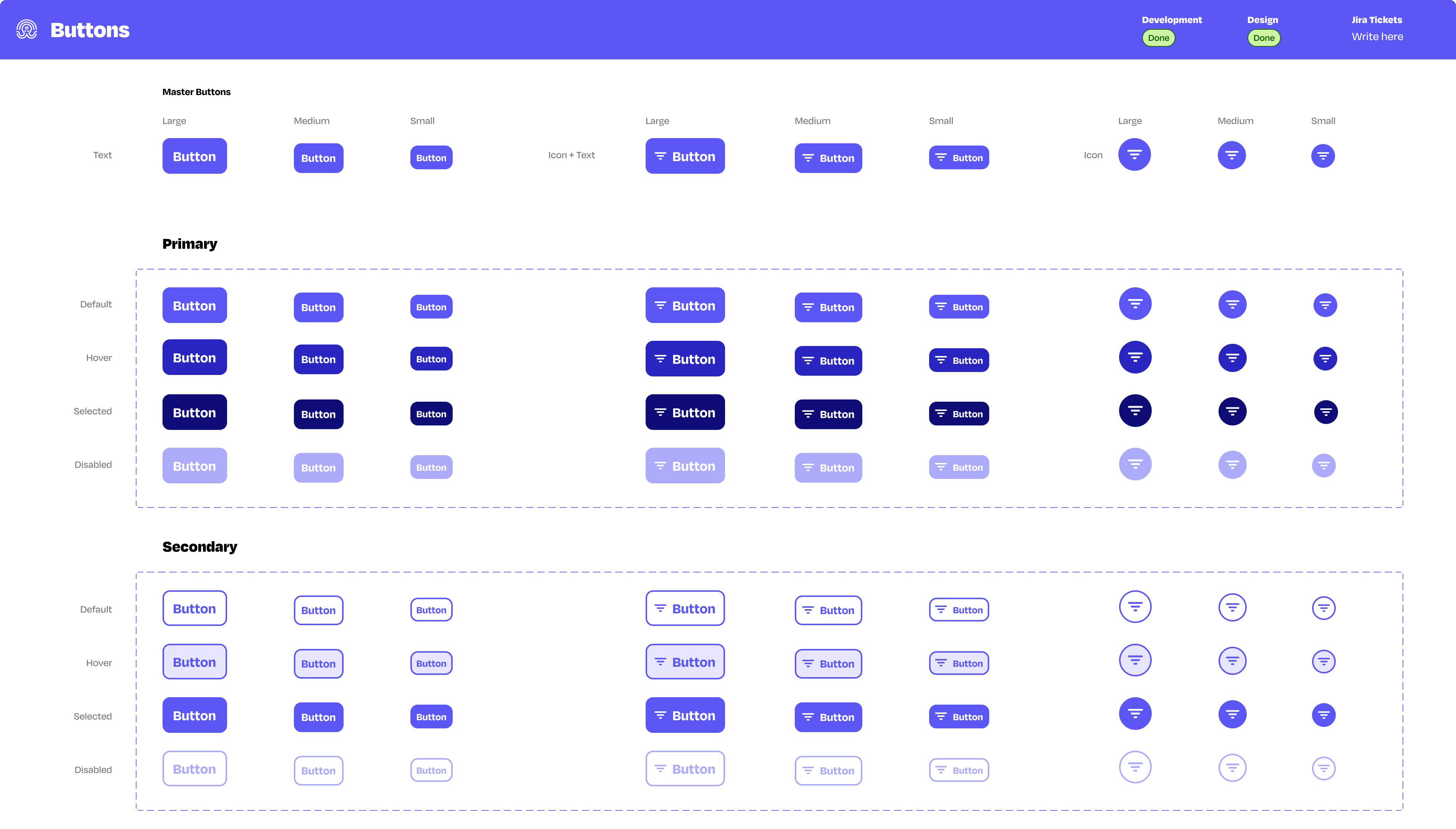
New Design System – Octopus
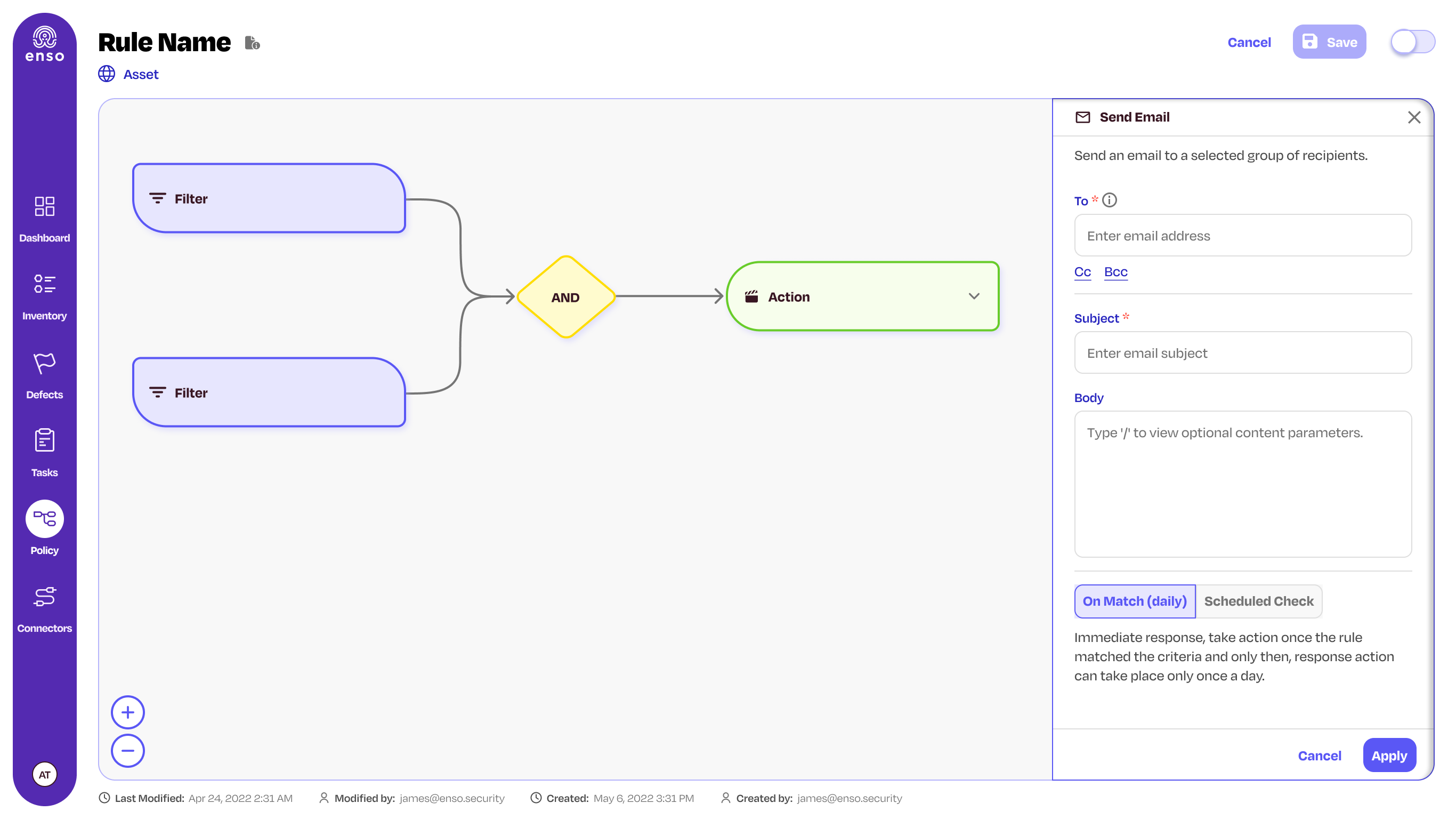
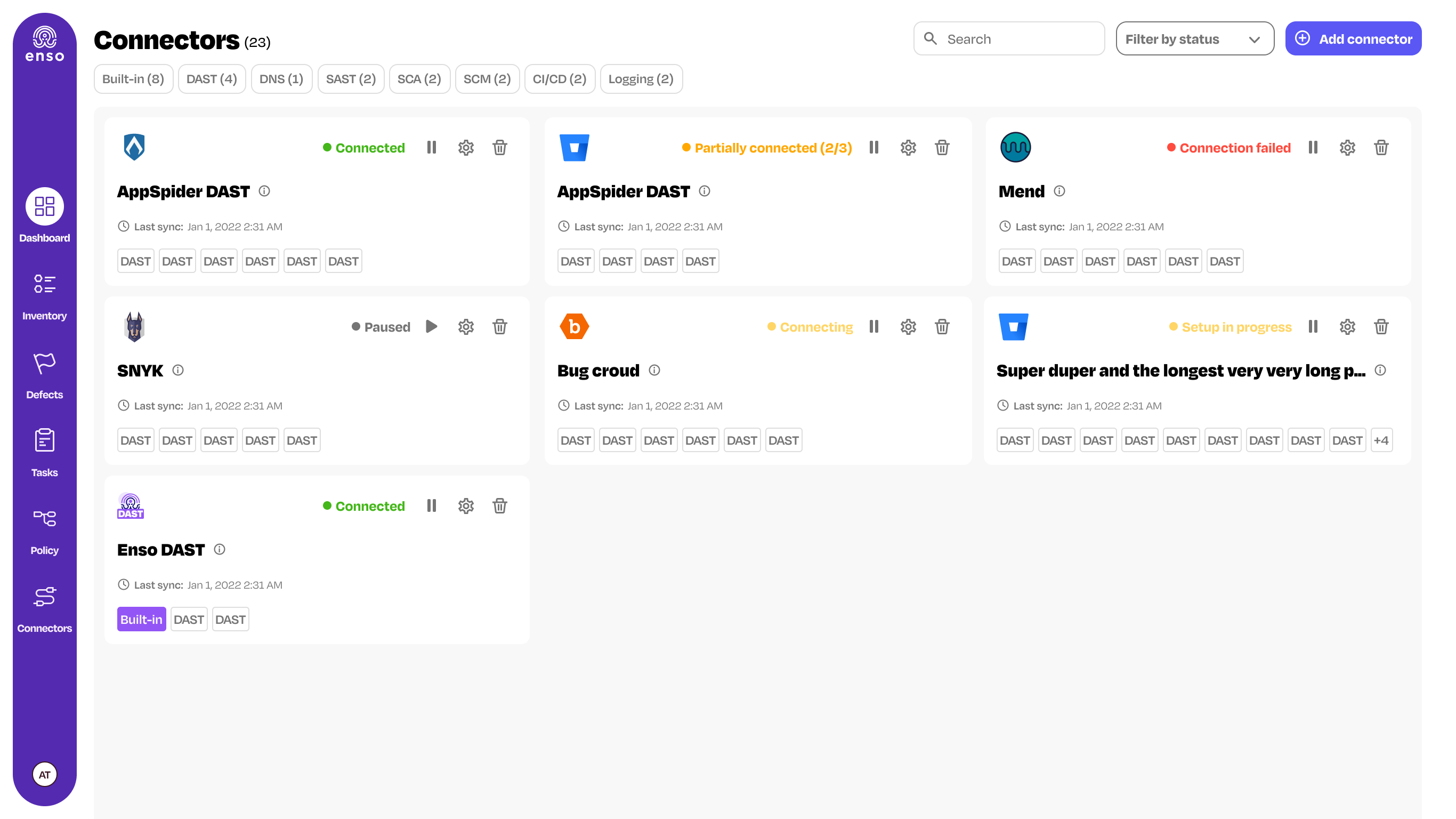
As part of the new design, I’ve created a new design system which didn’t exist before, and called it Octopus. All redesigned pages in the product were interfaced with the Octopus, which facilitated the easy update of the product design in case of any changes or alterations. The design system saved time for the development team, significantly shortened design times for new features, and allowed focusing on complex UX solutions rather than constantly dealing with the UI.
Furthermore, all components of the design system now meet the accessibility standards for the disables, and each has a full prototype, including animations, in order to allow the development and product teams, along with the users, to understand how the screens operate. All components can be activated with a click, both in the final product screen design, and in the Octopus itself.
Redesign Process - Business Outcomes
The redesign process has proved itself from a business standpoint: we’ve transitioned from design partners to paying customers. The design helped clients realize the significant value of Enso Security, and from a marketing perspective, it gave the product a more mature feel, more than it displayed before.
Success Stories
Snyk acquired Enso Security for over 50 million USD.
The company moved from design partners to paying customers.
Octopus, a new design system, saved time for development and product teams, and saved the company a lot of money.
Great people I liked working with
VP Product: Moti Peretz
Product Manager: Shady Kayuf
Frontend Team Lead: Gil Bouaron
Frontend Developers: Gal Rotem, Guy Yaffe - Ermoza, Nikolai Samokhin
VP R&D: Shahar Pavel
Co-Founder & CEO: Roy Erlich
Co-Founder & CTO: Barak Tawily
Co-Founder & Chief Architect: Chen Gour Arie
Co-Founder & CTO: Nir Giller
Co-Founder & CEO: Omer Shneider
VP Product: Nir Krumer
Product Managers: Ariel Saghiv, Amit Sheps, Liran Levy
VP R&D: Amit Porat
Full Stack Software Team Leader: Amos Guetta
R&D: Almog Kashani, Inbal Sion, Yonathan Doron

Substack
Don't Be a Stranger
Uncoated Magazine
All rights reserved © Tal Solomon Vardy. 2025
All rights reserved © Tal Solomon Vardy. 2025
